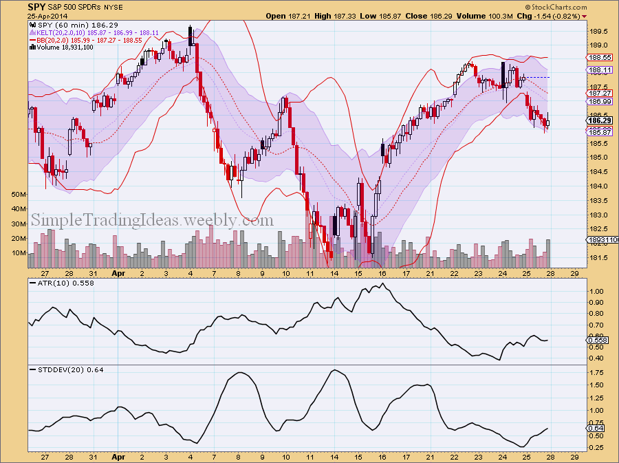
Both the Bollinger Bands (gold) and Keltner Channels (purple) are trend following indicators with a volatility based envelope as you can see on the 60-minute chart below of SPY, the S&P 500 ETF. They are trend following because the directions of the Bollinger Bands are dictated by the 20-period SMA (Simple Moving Average) and the directions of the Keltner Channels follow the 20-period EMA (Exponential Moving Average). The bands for the Bollinger bands are a multiplier times the Standard Deviation above and below the 20-period SMA. The channels for the Keltner Channels are a multiplier times the ATR (Average True Range) above and below the 20-period EMA. The multiplier is usually 2 for both the Bollinger Bands and Keltner Channels. Since the Standard Deviation is “more volatile” than the ATR as you can see on the 60-minute chart below The Bollinger Bands cover a wider range, often the Keltner Channels are within the Bollinger Bands. For this reason some traders prefer the Keltner Channels over the Bollinger Bands. Another reason is that the 20-period EMA is more sensitive than the 20-period SMA. On the chart below both moving averages turned down and the price is below these moving averages, which is short-term bearish.
0 Comments
The chart below shows VIX with a couple of 200-day Bollinger Bands. The difference is that the bands are calculated with different standard deviations, namely 2, 3 and 4 standard deviations. From the chart below my guess is that VIX is going to penetrate thru the 3 standard deviation band possibly the 4 standard deviation band which is barely visible on the chart (green). So VIX could go up to the 22-ish range.
The Bollinger Band finally opened up and VIX, the volatility index moved higher as investors are buying more put options. Below the chart the TRIX oscillator and Aroon trend indicator are shown. Both indicators confirm an uptrend for VIX which is bearish for the S&P 500, shown in the background.
The chart below shows the 50-day and 200-day moving averages for $CPCE, the CBOE Equity Put/Call Ratio. There is also the 200-day Bollinger Band with the 0.6 standard deviation bands. The S&P 500 index, $SPX is in the background for refernce. The chart starts in 2004. As you can see the 50-day moving average pretty much stays in the 0.6 standard deviation Bollinger Bands around the 200-day moving average. Notice how the 200-day moving average is moving lower and lower soon reaching low levels only mached in 2006 and 2011 on the chart. Also notice that the 50-day moving average is touching the lower Bollinger Band. In the past touching the lower band was followed by a sharp move higher.
The daily chart below shows SPY, the S&P 500 ETF for the past 12 years with the 50-day, 200-day, 400-day and 600-day moving averages and the 600-day Bollinger Band. Below the chart there is the PPO(50,600) (green) and PPO(200,600) (red). PPO is the Percentage Price Osciilator which is a momentum oscillator similar to MACD. It measures the difference between moving averages as a percentage of the larger moving average. For example PPO(50,600) measures the percentage difference between the 50-day and 600-day moving averages. Notice that both the red and green lines are reaching unusual high levels. Also on the chart notice how the moving averages are fanning out and the lower 600-day Bollinger Band is curving down. Also the price is above the upper Bollinger Band.
When volatility falls to a low level Bollinger Bands are narriwing as you can see on the chart below. This is called the Squeeze. Usually periods of low volatility are followed by periods of high volatility. Narrow bands can foreshadow a significant move either up or down. Since VIX is already on low level this move most likely will be a move higher.
The daily chart below shows SPY with two 50-period Bollinger Bands, one with 1 standard deviation and the other one with 2 standard deviation. SPY has been able to stay above the lower 1 standard deviation Bollinger Band and it has been strong enough to touch or move above the 2 standard deviation upper Bollinger Band during the time frame shown on the chart. In the past SPY moved lower after such an explosive move above the upper Bollinger Band.
The chart below shows SPY with the 20-day, 50-day and 200-day Bollinger Bands. Up until mid-May SPY was walking on the upper Bollinger Bands. Notice how momentum is fading since then and SPY is unable to move up to the 50-day and 200-day upper Bollinger Bands.
As I noted yersterday SPY found short-term support and nicely advenced today. The chart below shows the daily chart for SPY today. There is certain weakness on the chart. One of them is that MACD is still below the signal line and the other one is that CCI and its 10 period MA are both below 0. If SPY continues to move up next week my upside target would be close to the upper Bollinger Band.
|
Loading
Search Site
Links
Archives
September 2014
Categories
All
|